Anyfin - Bringing clarity to loan offers to boost conversion
UX, UI
Refinancing loans can feel intimidating, as users often struggle to interpret complex financial terms and are unsure whether they are making informed financial decisions. At Anyfin, I led the research and design of a clearer offer flow that made terms easier to understand, enabling users to make confident financial decisions. Refining this flow was crucial not only for supporting users in managing debt but also for boosting offer conversion.
The ask: Improve user experience of loan offer to help increase conversion in all markets (Sweden, Germany & Finland).
My role: Lead designer in entire design process, from conducting user research to design iteration & final implementation in the app.
The team: Product designer, product lead, product manager, & 2 developers.
Understanding pain points in the existing flow through unmoderated user tests
To uncover where users struggled, I ran unmoderated usability tests (UserTesting.com) to evaluate how users understood & interacted with the current loan offer flow.
User research setup:
10 testers across 2 markets (Sweden & Germany)
2 prototypes
3 key tasks: find the offer on home, view & interpret the offer, complete signing
Mix of methods: task success, clarity ratings (5-point scale), & open-ended feedback questions. This setup allowed me to capture both quantitative measures (ease, clarity, impressions) & qualitative insights (what felt unclear, what was missing, what users expected).
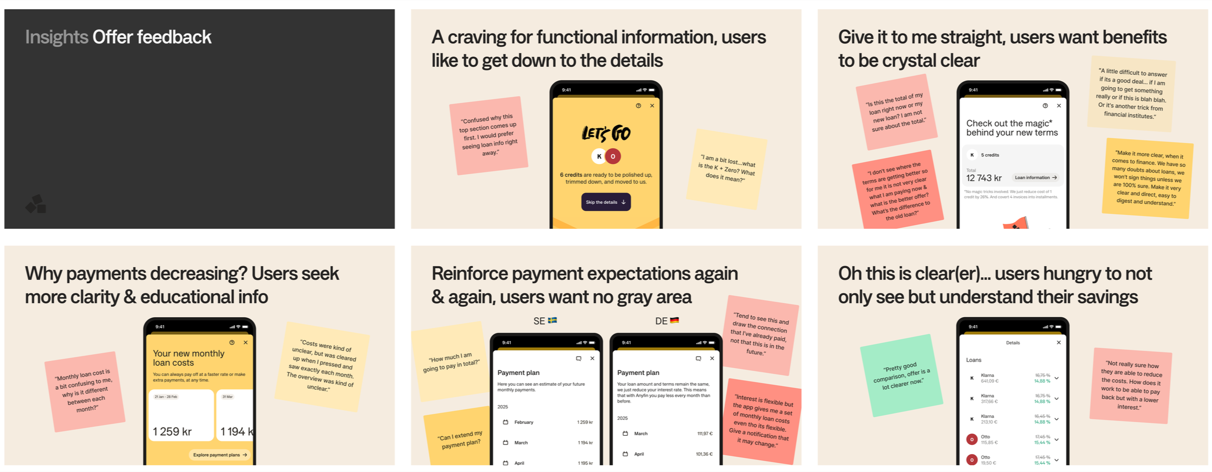
Key insights: Users crave functional information & clear benefits
The existing offer page left many users confused. Unclear loan terms, fluctuating payment amounts, & hidden savings made them question whether they were truly benefiting. Some even missed critical information because key actions weren’t obvious or did not feel actionable.
Users wanted to:
Dive straight into the details
Understand total loan costs vs. monthly loan costs
Easily compare old vs. new terms side by side
Hesitation to sign loan offer came not from unwillingness, but from a lack of transparency & understanding of how new terms benefit them.
Prototyping 3 design directions and validating with users
Insights revealed the need for a simpler offer experience with clear language, consistent cost breakdowns, & greater upfront visibility of savings. I explored three design directions, each addressing these needs in slightly different ways & with varying levels of departure from the current offer experience.
User research setup:
10 testers across 2 markets (Sweden & Germany)
3 prototypes
3 key tasks: find the offer on home, view & interpret the offer, complete signing
Mix of methods: task success, clarity ratings (5-point scale), & open-ended feedback questions.
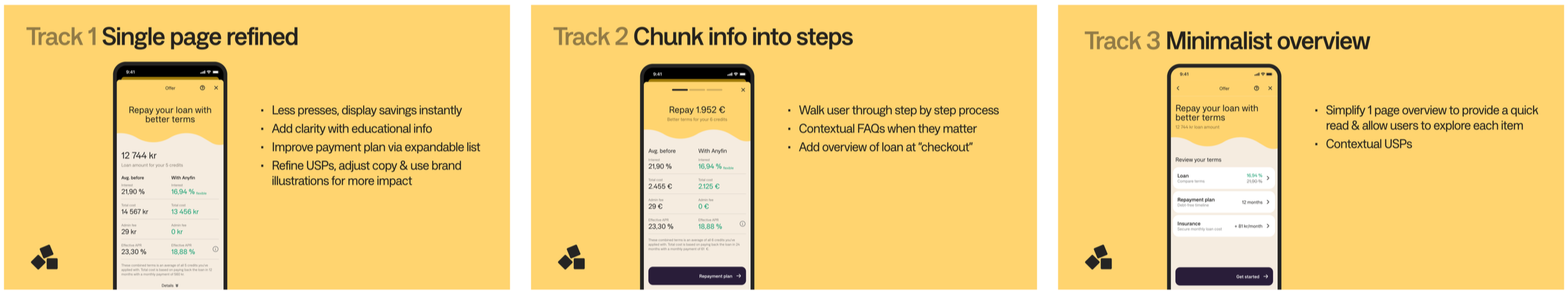
3 design directions with varying levels of departure from the current offer experience.
Key insights - Clarity through educational information builds trust & confidence
User testing showed that adding functional elements before the scroll, especially a comparison chart, made a big impact. It helped users quickly understand the value, boosted confidence, & removed the need for “mental math” to calculate savings.
We also introduced contextual FAQs based on earlier testing. These reduced repayment uncertainties for new users & further increased trust in the offer experience.
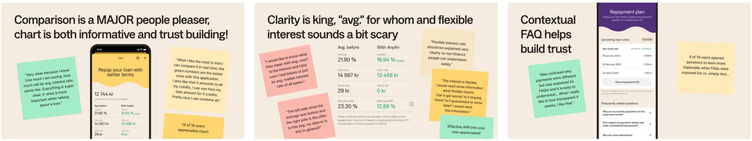
Sample insights from unmoderated research of 3 design directions
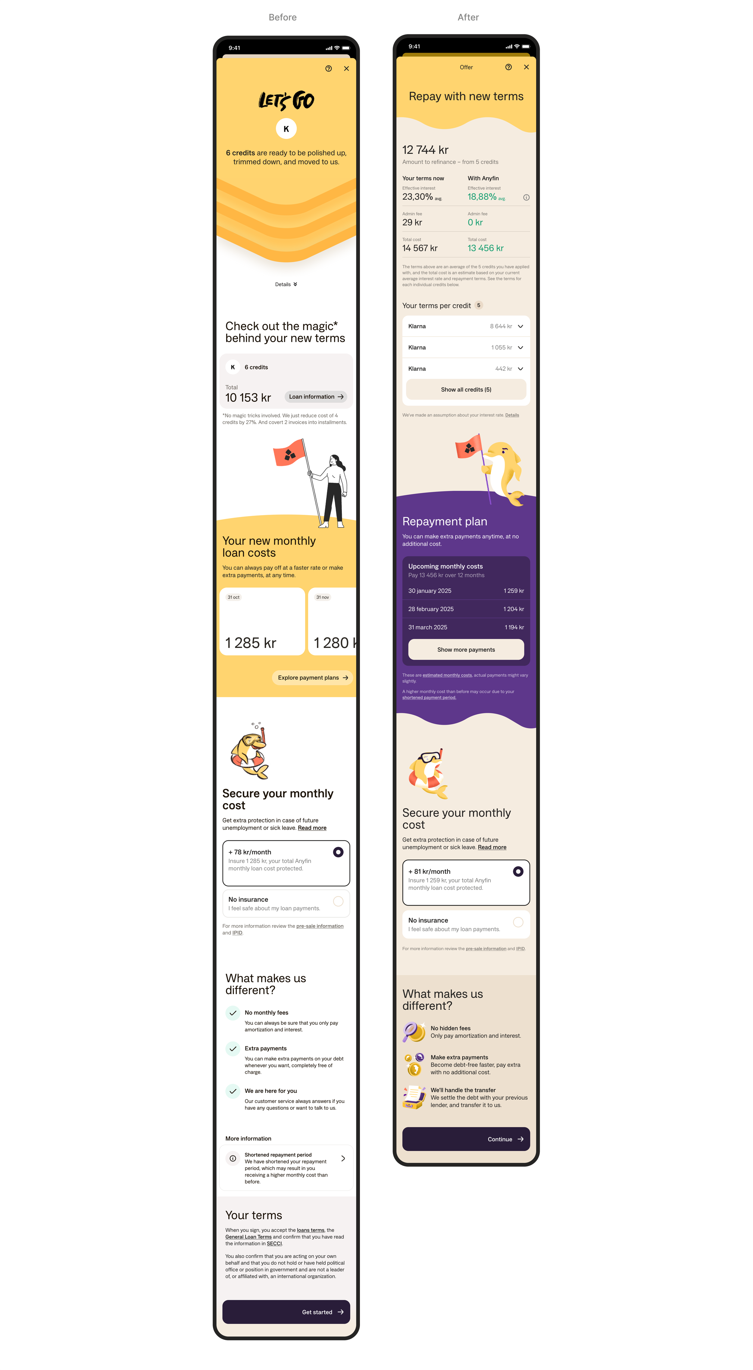
Final Design - Refining current single-page layout as first iteration
For the first iteration of improving clarity to the offer flow, we decided to continue with the existing single-page layout. While multi-step and minimalist overview concepts tested well, focusing on refining the current design with user insights was the most feasible approach given scope & resource constraints.
Some key improvements:
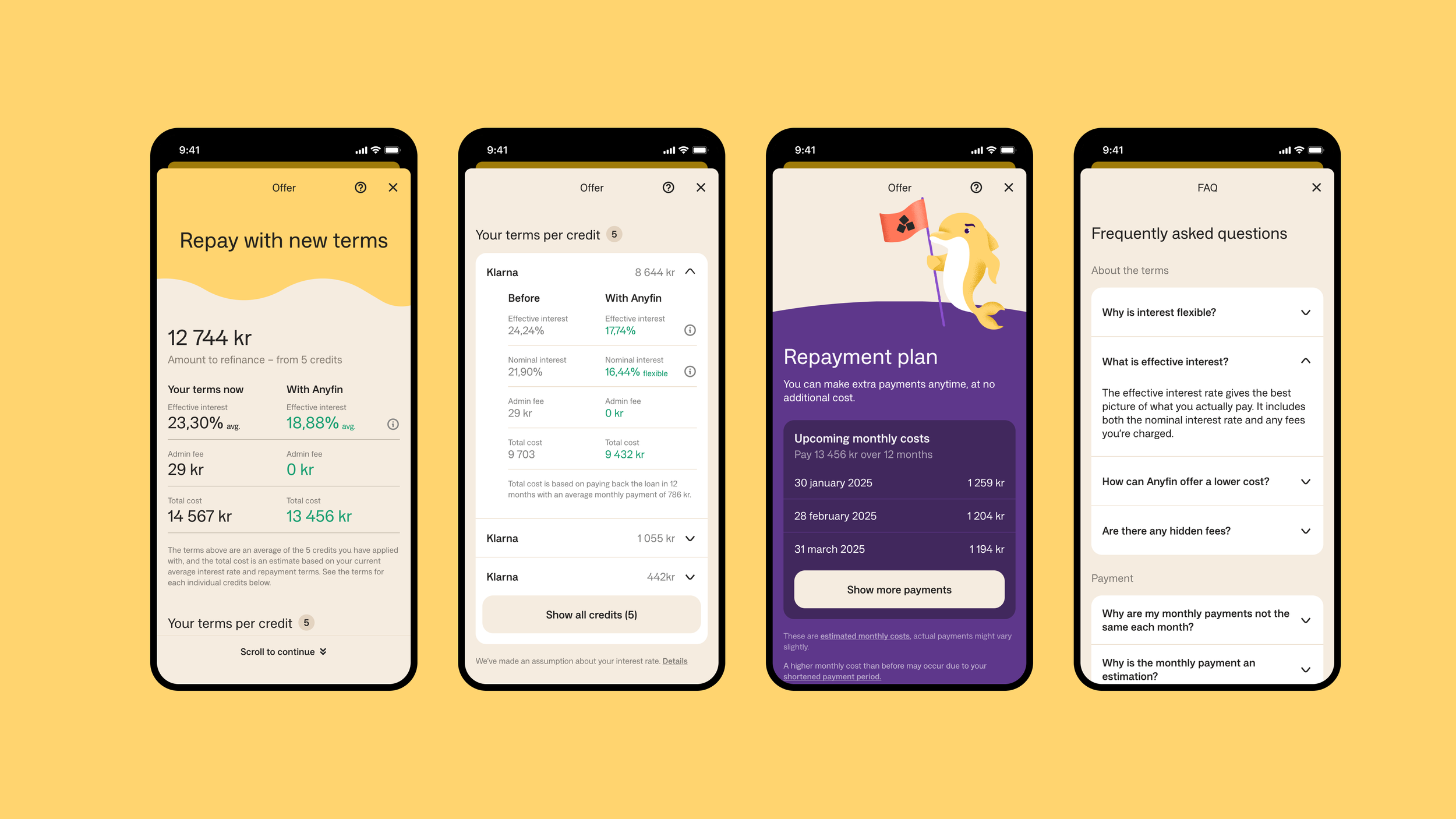
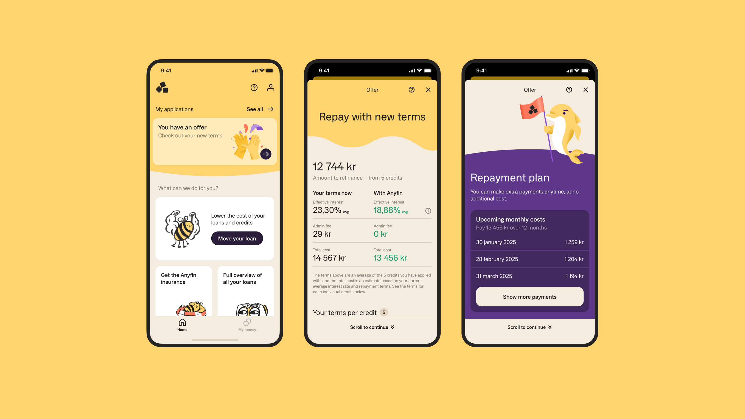
Comparison chart upfront: Savings comparison is now shown immediately in the header, no scrolling or extra clicks needed to see average savings of all credits.
Credit breakdown on demand: Users can expand to view terms for each individual credit without leaving the offer page.
Contextual FAQs: Info icons & links connect to improved FAQs, addressing common questions uncovered in research.
Clearer monthly costs: A simple list of the first 3 payments replaces horizontal scroll, with added details on total loan cost & loan length to give users more context to how repayment will look like.