Nordnet - Transparent Banking and branding deep data
BRANDING, UI DASHBOARD
At Seventy Agency, we worked with Nordic investments company, Nordnet, to define a new brand essence – Transparent Banking. They were already delivering towards this in their products and services, but their visual identity and website was often more cluttered and confusing than clear and transparent.
We partnered up with Nordnet’s brand and product development teams to develop: a new visual identity, online brand guideline, & UI of a customer’s investment dashboard.
My role: Designer contributing to development of the new visual identity, lead on creating the online brand guidelines & UI of customer platform. The team consisted of two Designers, a Design Lead, & a Strategist.


Design concept routed in beautiful data
Nordnet’s strength lies in its ability to supply market information to users. This information should not only be informative, but beautiful.
By making use of bold colors and dynamic textures, we created distinct data visualizations that become Nordnet brand indicators. These infographics are instantly recognizable in the financial world, becoming a tool to create stunning graphic landscapes in marketing material as well as a tool to show stock & fund investment performance to users.


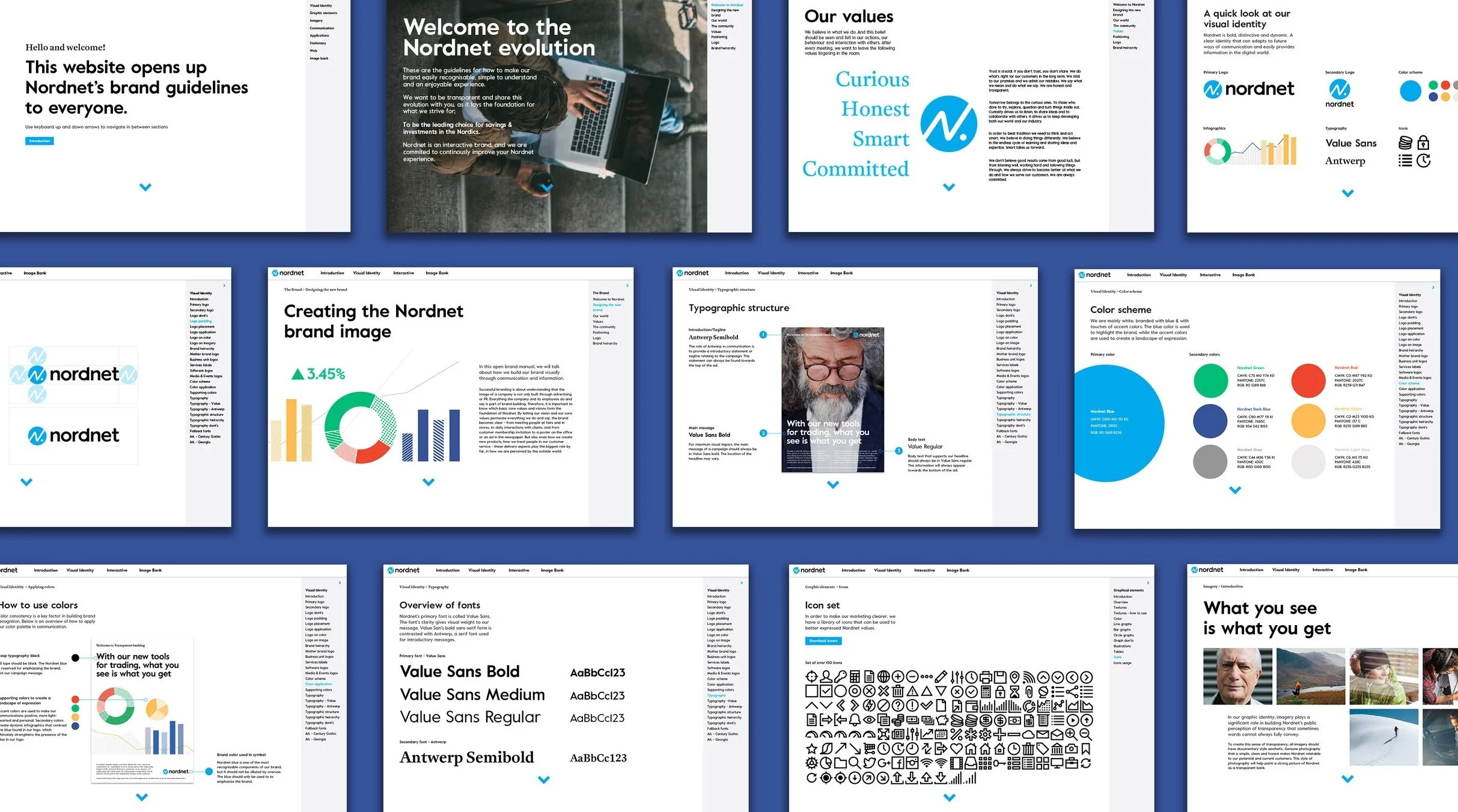
Online brand guidelines
We carried Nordnet’s commitment to being a Transparent Banking solution in their brand guidelines, an online open document that’s accessible to all. This in depth guidelines was created in Sketch to be handed off to Nordnet’s development team, a program I was unfamiliar with at the time. Content ranged from the brand strategy, visual identity & graphic element, iconography, image bank & photo editing actions, sample marketing assets, & a UI kit.

Building a dashboard, enabling customization
We developed a new more personal way for Nordnet customers to control and interact with their investments. By adding dashboards, users can personalize different views and select what widgets and information to show on each. Visual cues and interactive elements simplify navigation and encourage action.

Introducing widgets
Organizing information into customizable widgets was the foundation of the new Dashboard. These widgets can be edited, re-arranged, or expanded to fit the needs and interests of the investor. I worked with the UI/UX team at Nordnet to help establish the “widget” concept for the customer platform. Designed & established typographic hierarchy within widget designs.


UI kit & interaction guidelines
We created a basic UI kit for the Nordnet development team. Consistent rules where established within the UI, including: the Dashboard grid system, the grid system within each expandable widget, styling of UI elements and the widget’s typographic hierarchy.


Sad note: this project is 4 years old & Nordnet has now redesigned their visual identity. I am very proud of the work so show it even after its “death”.